Flags Flagged for Plagiarism
When people ask me “What types of work do you see plagiarism in?” my usual response is “In any type of work that requires creativity.”
You can easily find stories of plagiarism in architecture, plagiarism in fashion, plagiarism in recipes, plagiarism in typography, plagiarism in knitting and much, much more. Though it’s tempting to view plagiarism through the prism something that only impacts textual works, plagiarism can impact literally any creative field.
Basically, as long as creativity is required to make something, it’s a pretty safe bet that there will be plagiarism and allegations of plagiarism in that field.
It seems nothing is truly safe as now we have plagiarism accusations in another seemingly unlikely place: Flag design (Vexillography).
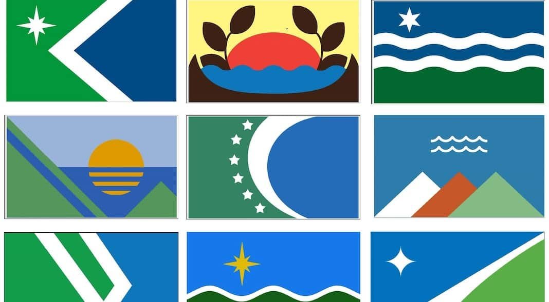
The city of Duluth, Minnesota is holding a contest to redesign the city flag. The contest began with some 195 public submissions that were then whittled down by volunteers to 41 semifinalists. It was then reduced to nine finalists, which are now up for a public vote.
However, two of those nine finalists have been accused of plagiarism, with the selection committee promising to “Internally continue to reach out to the artists whose work is in question,” and “Do our own research to find out if there is a plagiarism issue.”
While the committee did say they were not jumping to conclusions, they also said they are committed to having a unique flag and that the final decision is in conjunction with the committee and the mayor’s office, not just left to the open vote.
The names of the artists involved have not been released.
So what happened in Duluth and what can we learn from it? To answer that, we have to first look at the alleged plagiarism.
The Duluth Flag Plagiarism Allegations
The allegations center on two separate designs for the Duluth flag. The first, is the one that’s gotten the most attention.

That design stands accused of being extremely similar to a design by Holly Jakub, who created a redesign of the Minnesota State flag as part of her Advanced Problems in Graphic Design, Fall 2017 course.

Jakub, on her page, outlines the process of how she came up with the design including evaluating the current flag, creating countless iterations of the design and eventually settling the one above.
The similarities between the two flags are pretty obvious. Both use a white six-pointed star sitting in the green half of a two-tone flag that features green and blue sections on the left and right respectively. In both cases, the two halves are separated by a thin white, sideways chevron that points to the left.
While there are differences, most notably that the star is much smaller in the Duluth version and the colors are slightly different tints between the two flags, the similarities are very easy to grasp.
The second one has been much more controversial, at least according to commenters, as it features this flag from the design competition.

This flag is also accused of plagiarizing a student’s design, this Deon Mixon, who created the design as part of a project to reimagine the flag for the city of Detroit, Michigan.
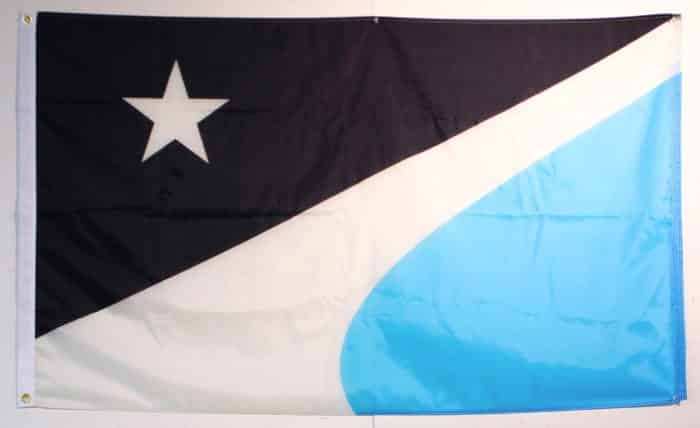
The main similarity between the flags is the use of stars in the upper-left corners of each flag and a three-color layout that features a dominant color in the upper-left, a “swoop” style stripe of white and a secondary color in the bottom right.
However, the color choices between the two are very different with Mixon going for a black, white and light blue scheme while the contest submission uses a blue, white and green pallet. Also, the contest submission uses a four-pointed where Mixon uses a five-pointed star.
In the end, the most striking visual element between the two is the “swoop” stripe. While the angles and placement of them are very similar, Mixon’s is much wider and takes up much more of the flag.
So did plagiarism occur? It’s pretty much impossible to say with these cases but there’s certainly reason to be suspicious and at least discuss the possibility.
Flags and Plagiarism
Disclosure: I am not an expert in Vexillography and only have a passing familiarity with the craft.
Vexillography, as with any other art, has its own set of standards, tropes and common elements. For example, many flags use the same colors or patterns without issue.
According to Time Magazine, 14.3% of all national flags use the same shade of red. Stars are one of the most common symbols to be used on flags (including three, four, five, six, seven and beyond points) as are stripes, chevrons and the list goes on.
The problem this creates is that for an outsider, like me, it can be very difficult to separate out what is what is merely a common trait versus what is a plagiarism. After all, if you were unfamiliar with the romance novel genre, it would be very easy to believe that two unrelated stories are plagiarism of one another.
This is something we explored last year as we created a fake plagiarism story, jokingly accusing the Rocky Horror Picture Show of being a plagiarism of a somewhat-obscure Star Trek episode. Of course, it’s not true but it shows how two works playing off the same tropes can have a lot of similarities.
All of that aside, I (with my non-expert eyes) agree that the first one is worrisome. The similarities in color, shape and symbols are just too great to ignore. Other than the shades of the colors and the size/position of the star, they’re nearly identical works. To make matters worse, the original was a project to redesign the flag for the state Duluth is in, making it very likely the designer of the contest version ran across it.
With the second, the evidence seems less convincing. Though the swoosh is a particularly unique element for a flag, the swoosh and the presence of a star are the only real similarities and even the two swooshes are very different.
Even if the contest entrant did see Mixon’s flag, which is also possible and maybe even likely, it may be a case of inspiration versus plagiarism. That, however, would be something for students of Vexillography to answer.
Still, it may not matter at all if the similarities are plagiarism, coincidence or inspiration as the committee has made it pretty clear that they are putting a premium on uniqueness when it comes to their new flag design.
As such, the cause of the similarity may not be as important as the fact there is similarity when it comes to determining the outcome.
There are seven other flags still in the running and it is safe to say that they received a boost in their chances because of this story.
Bottom Line
Plagiarism is rarely a black or white subject. Proving plagiarism often means eliminating other factors such as coincidence, common tropes and benign inspiration. It can be difficult at best and rarely leads to a cut and dry answer.
That being said, determining whether plagiarism took place or not is not always the most important thing. Originality is often more important than the cause of or unoriginality.
That is likely the case here. The committee is trying to choose a flag for a city, not defend a finished flag or other finished work. There are other candidates that they can choose from and literally leave all of this behind.
To that end, all involved are fortunate that these similarities were caught when they were. This story would have been MUCH worse if one of these flags won. That would mean that the City of Duluth has to scramble to learn the truth, the artist behind the flag would presumably have their name be public and a lot of work might have to be undone.
While one of these designs could still win, it seems unlikely. If nothing else, it the City of Duluth likely doesn’t want to attract more scrutiny to their new flag than absolutely necessary.
Want to Reuse or Republish this Content?
If you want to feature this article in your site, classroom or elsewhere, just let us know! We usually grant permission within 24 hours.